Google UX Certification
I believe great design comes from staying curious. To deepen my craft, I completed the Google UX Design Certification, a self‑paced program where I practiced everything from user research to wireframing, prototyping, and peer reviews. The three projects below represent the work I created throughout the course.
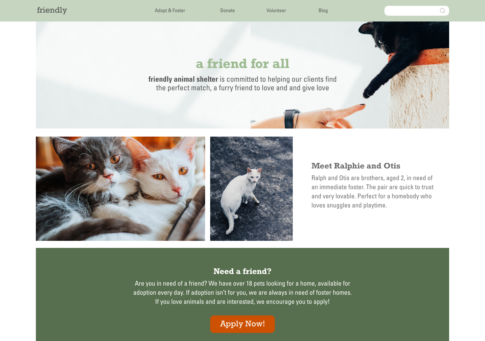
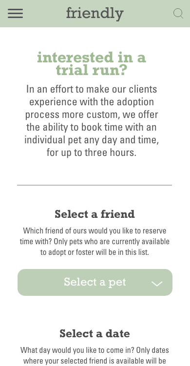
Friendly Animal Shelter
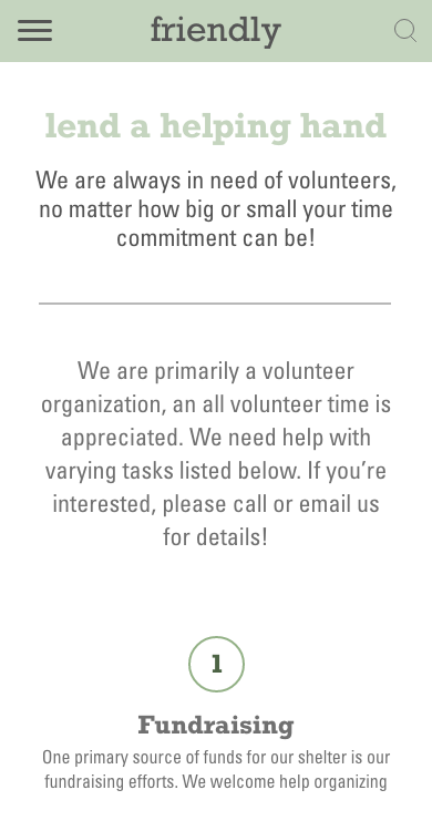
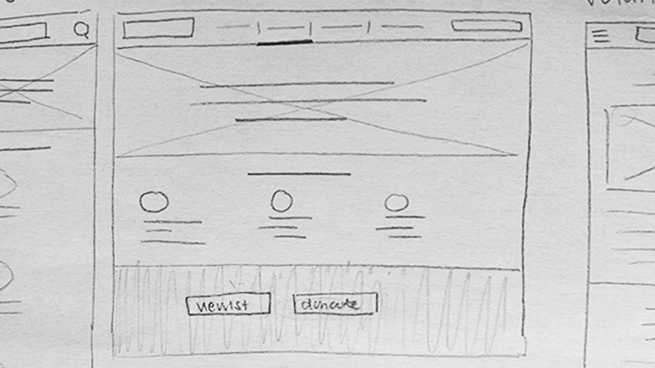
I designed a responsive website for Friendly Animal Shelter, an organization dedicated to helping people find the perfect furry companion to love, and be loved by. The site gives users a welcoming space to explore adoption and fostering opportunities, as well as ways to support the shelter through volunteering or donations.
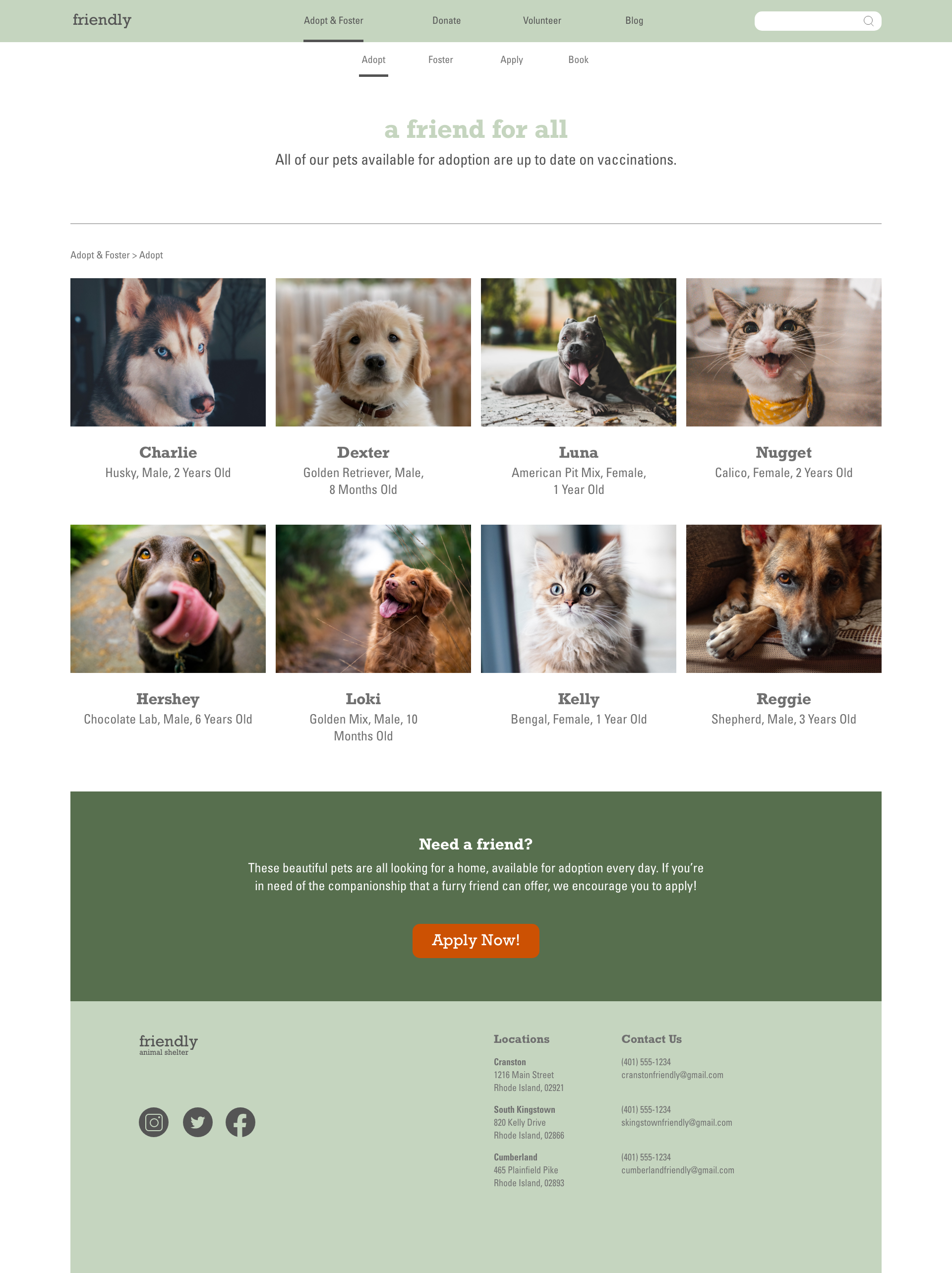
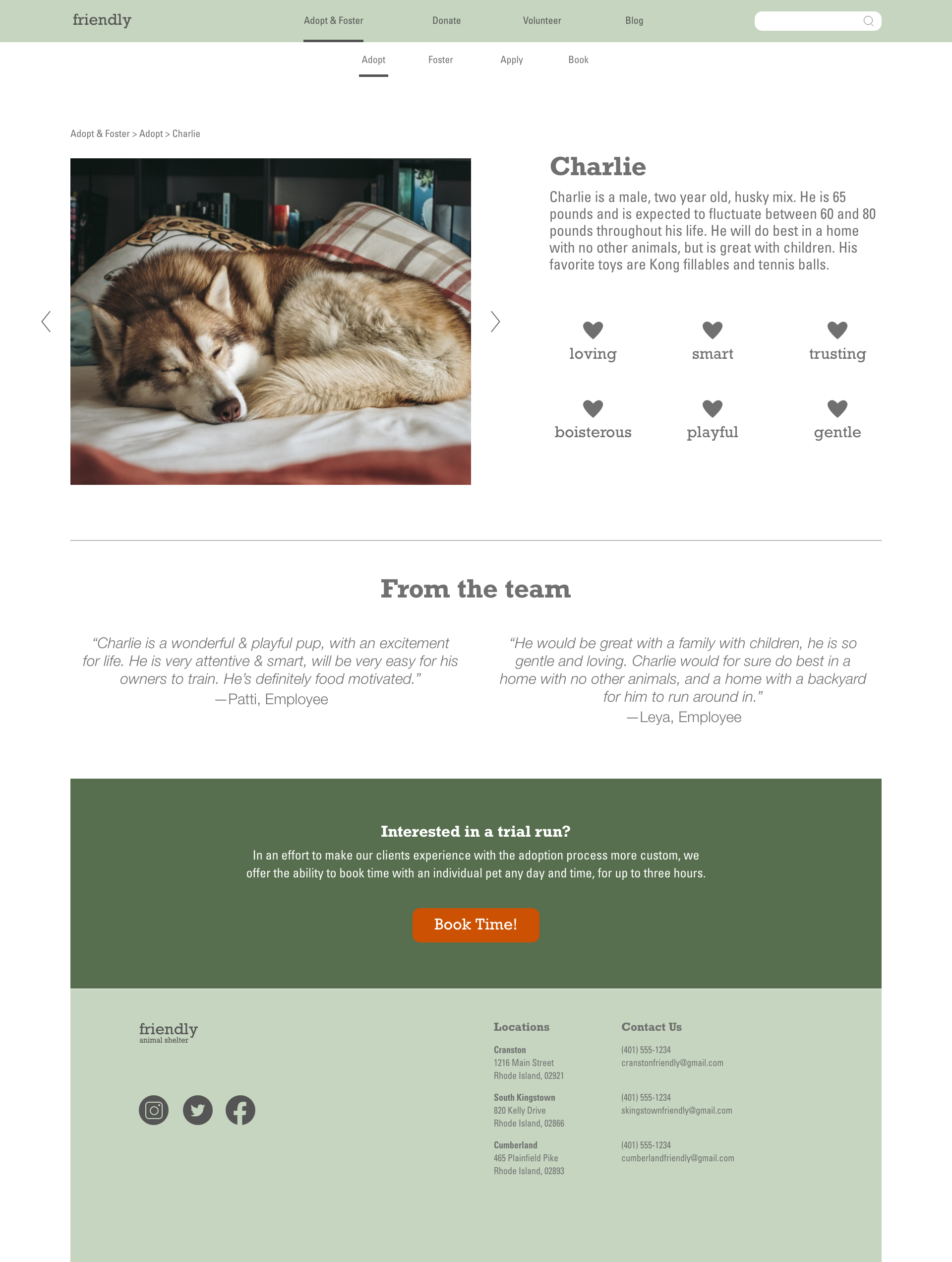
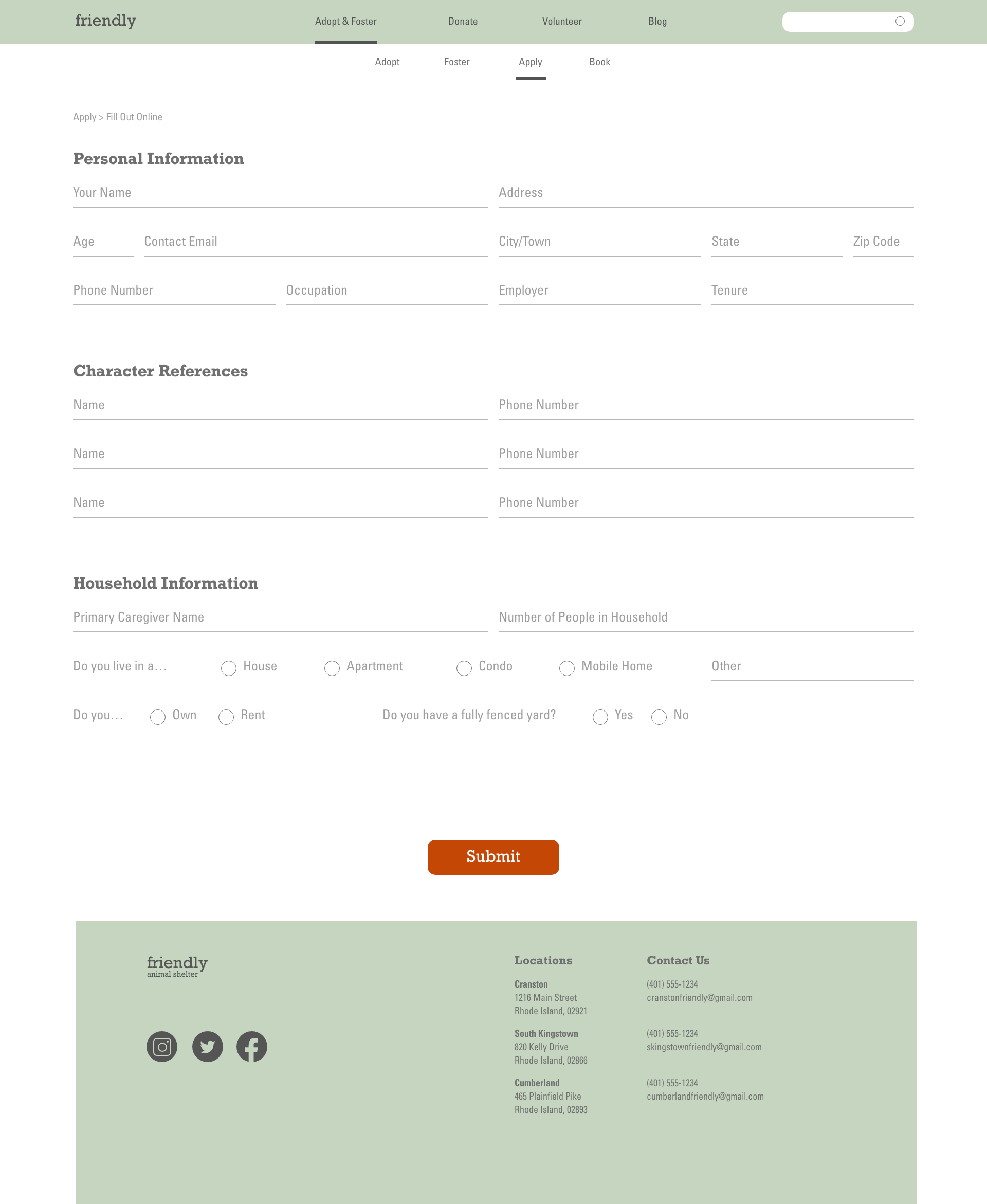
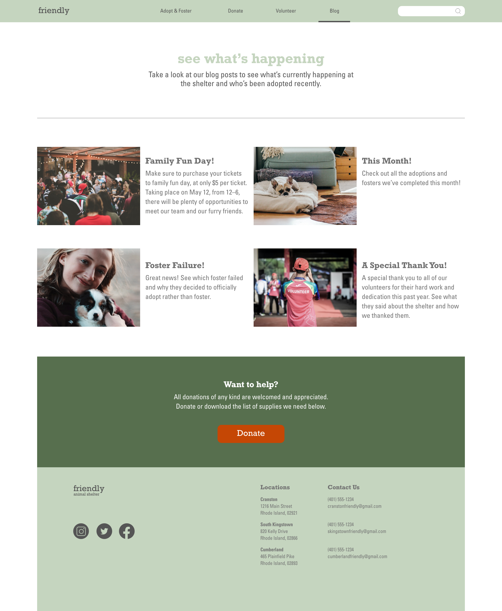
The visual language of the site is designed to feel warm, calm, and approachable. Every choice supports a single goal: helping users feel focused and supported to make the best informed decision for themselves. By keeping the interface clean and uncluttered, the experience avoids overwhelm and instead creates space for authenticity, connection, and thoughtful action.
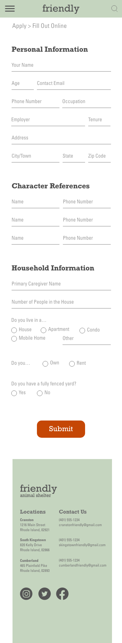
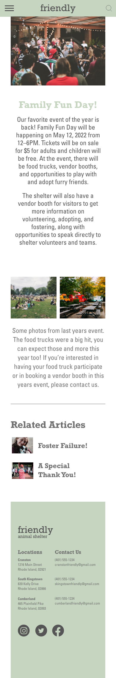
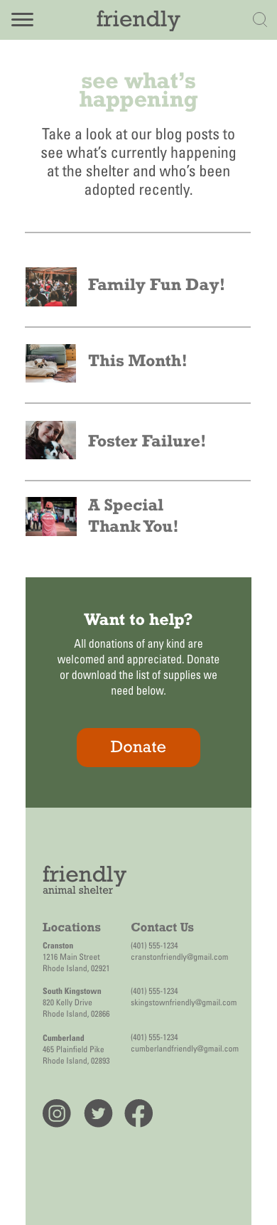
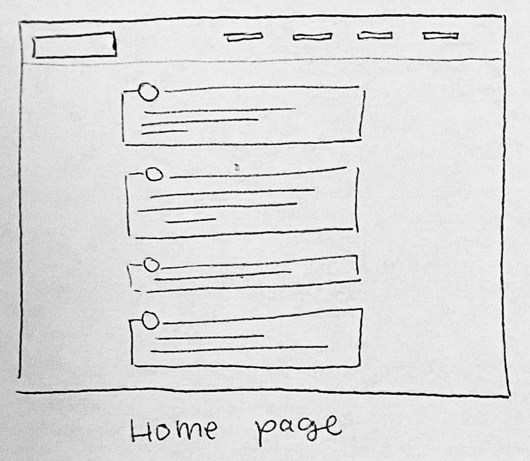
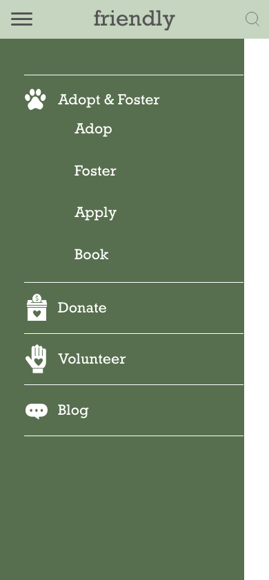
Mobile wireframes

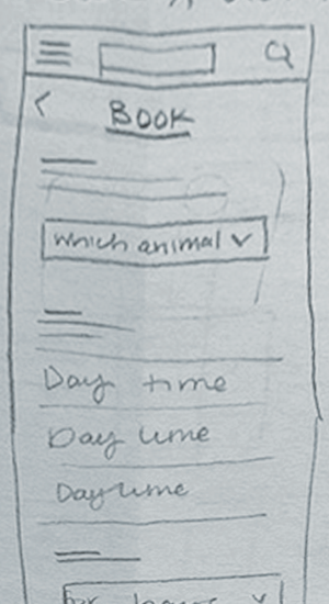

Desktop wireframes
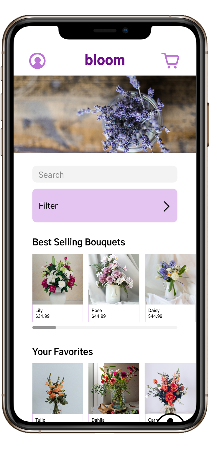
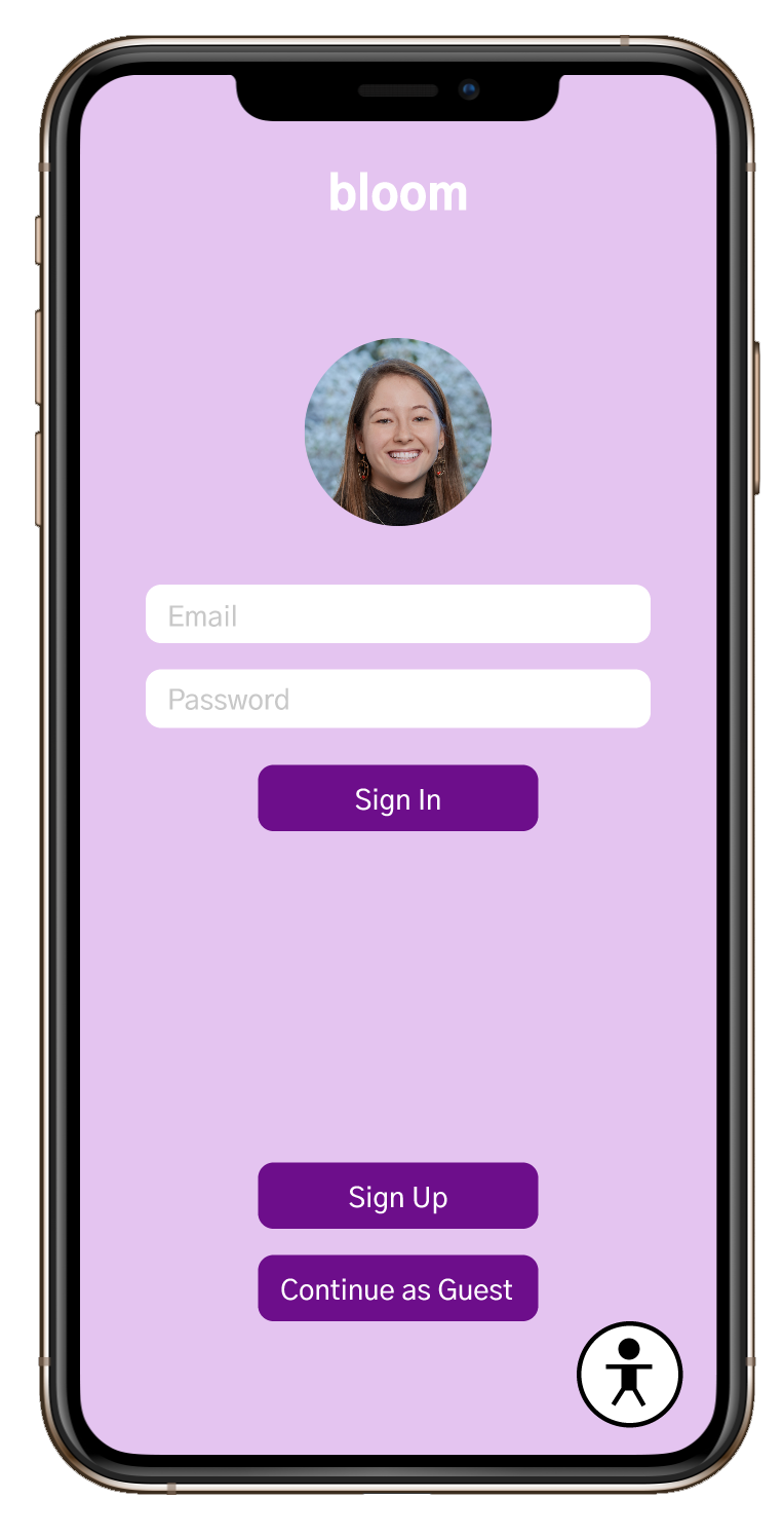
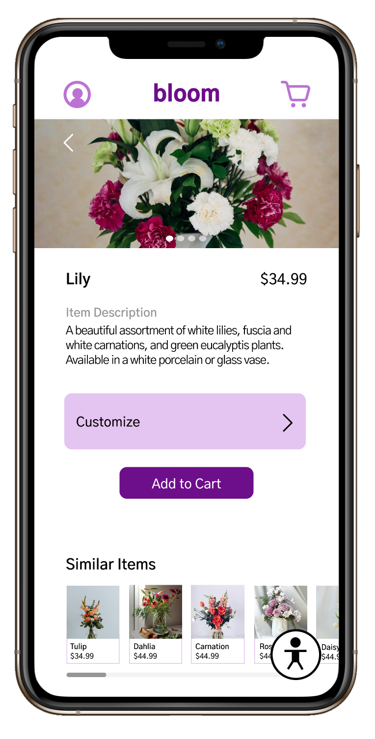
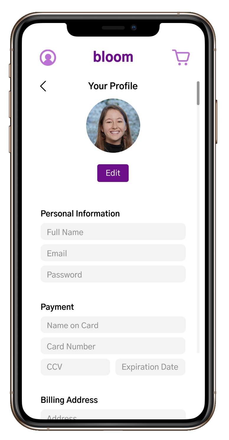
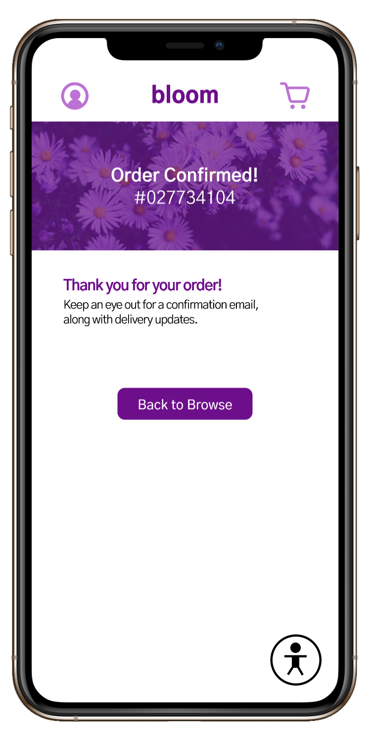
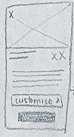
Bloom
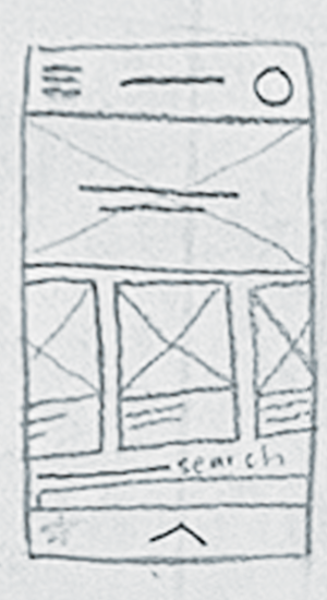
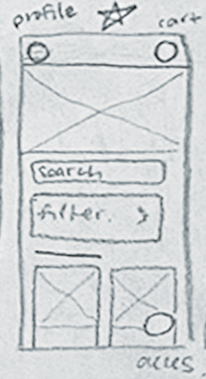
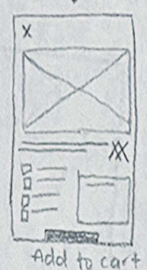
Bloom is a mobile app for a bouquet‑delivery company, created to make sending flowers feel more personal, meaningful, and effortless. The experience focuses on customization and connection, allowing users to build bouquets that reflect their intentions, save favorites for future moments, and easily revisit past orders. The goal is to bring warmth and thoughtfulness into a process that’s often rushed, helping users express care in a way that feels genuine and beautifully simple.
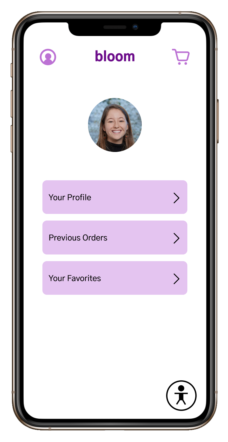


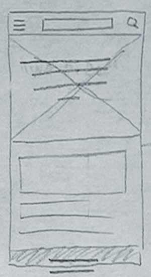
App wireframes

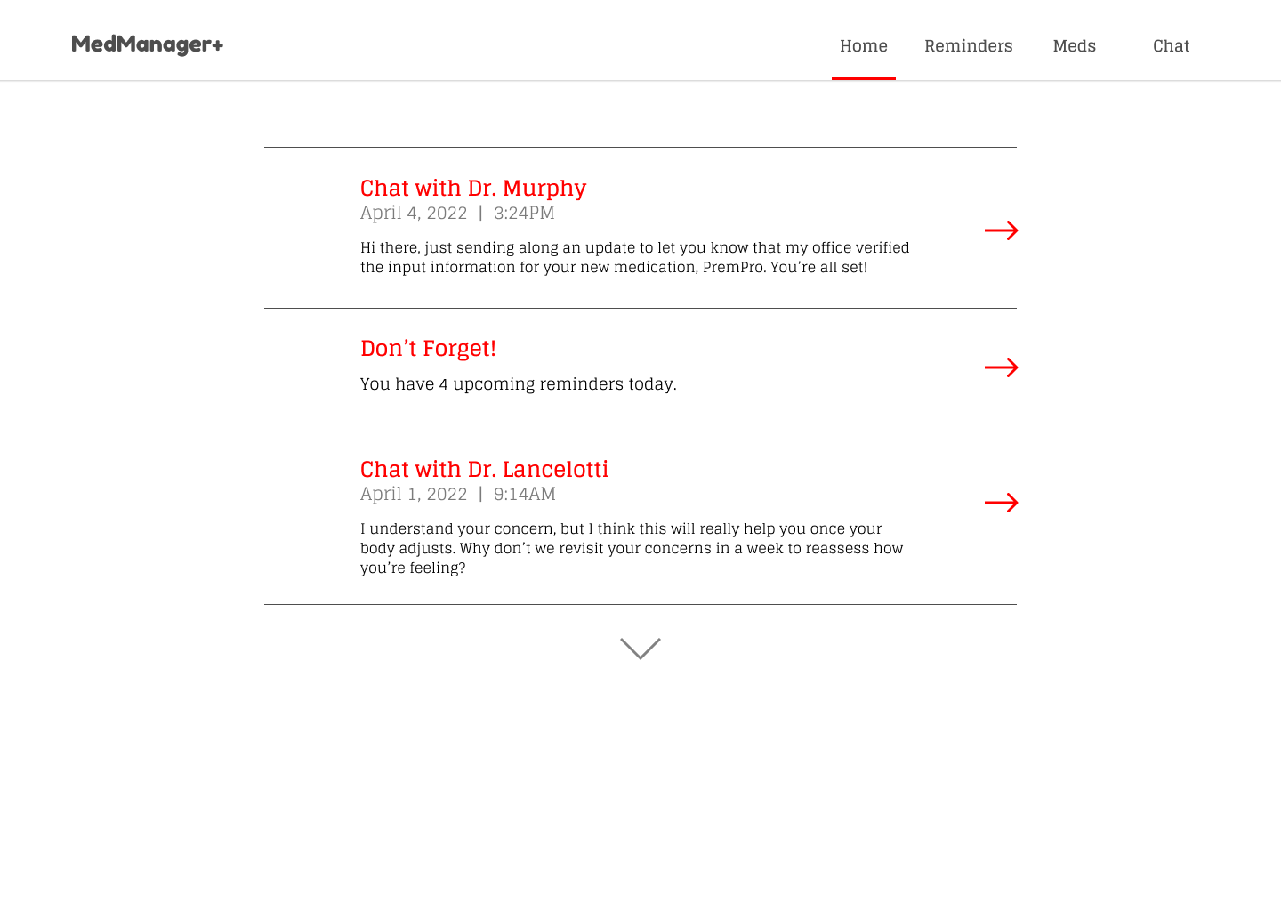
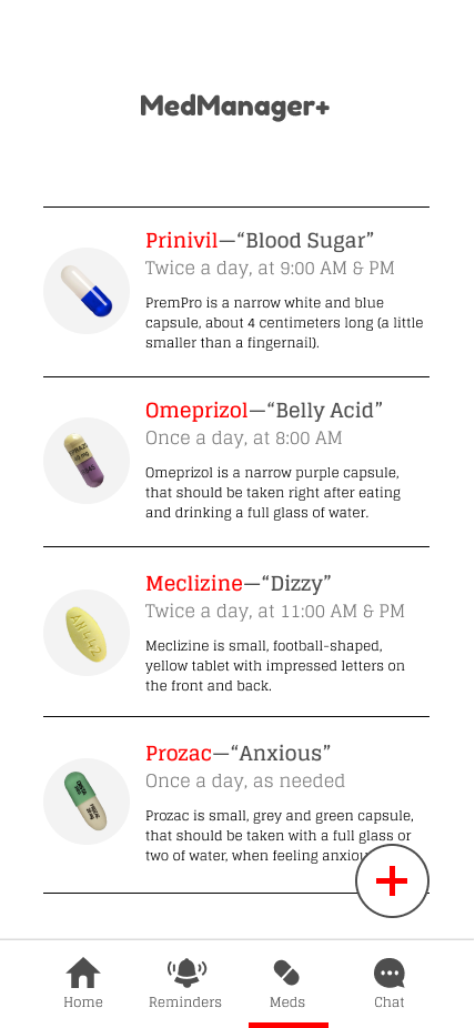


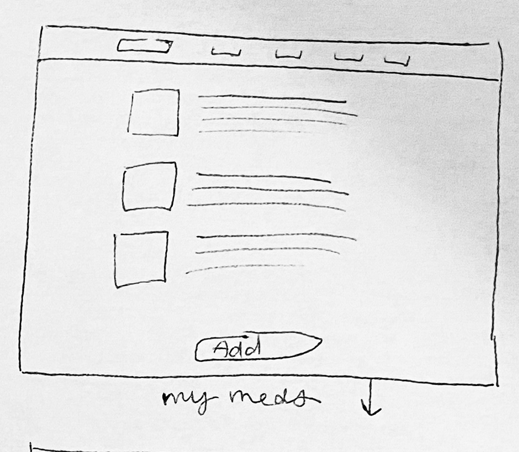
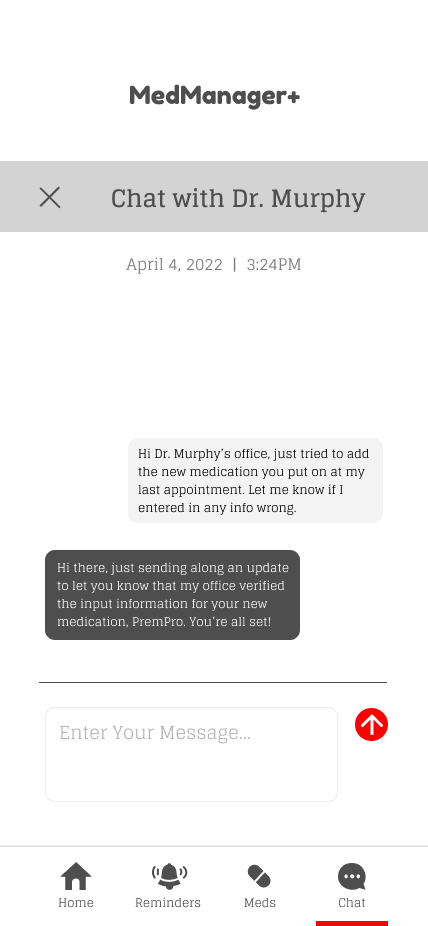
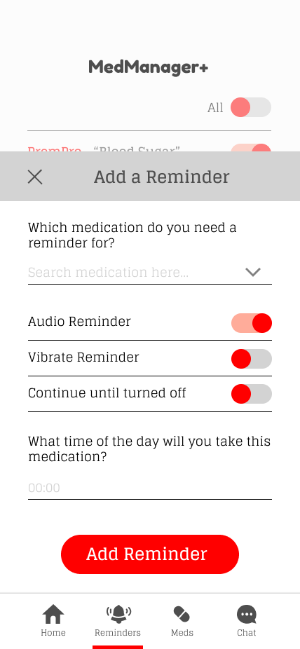
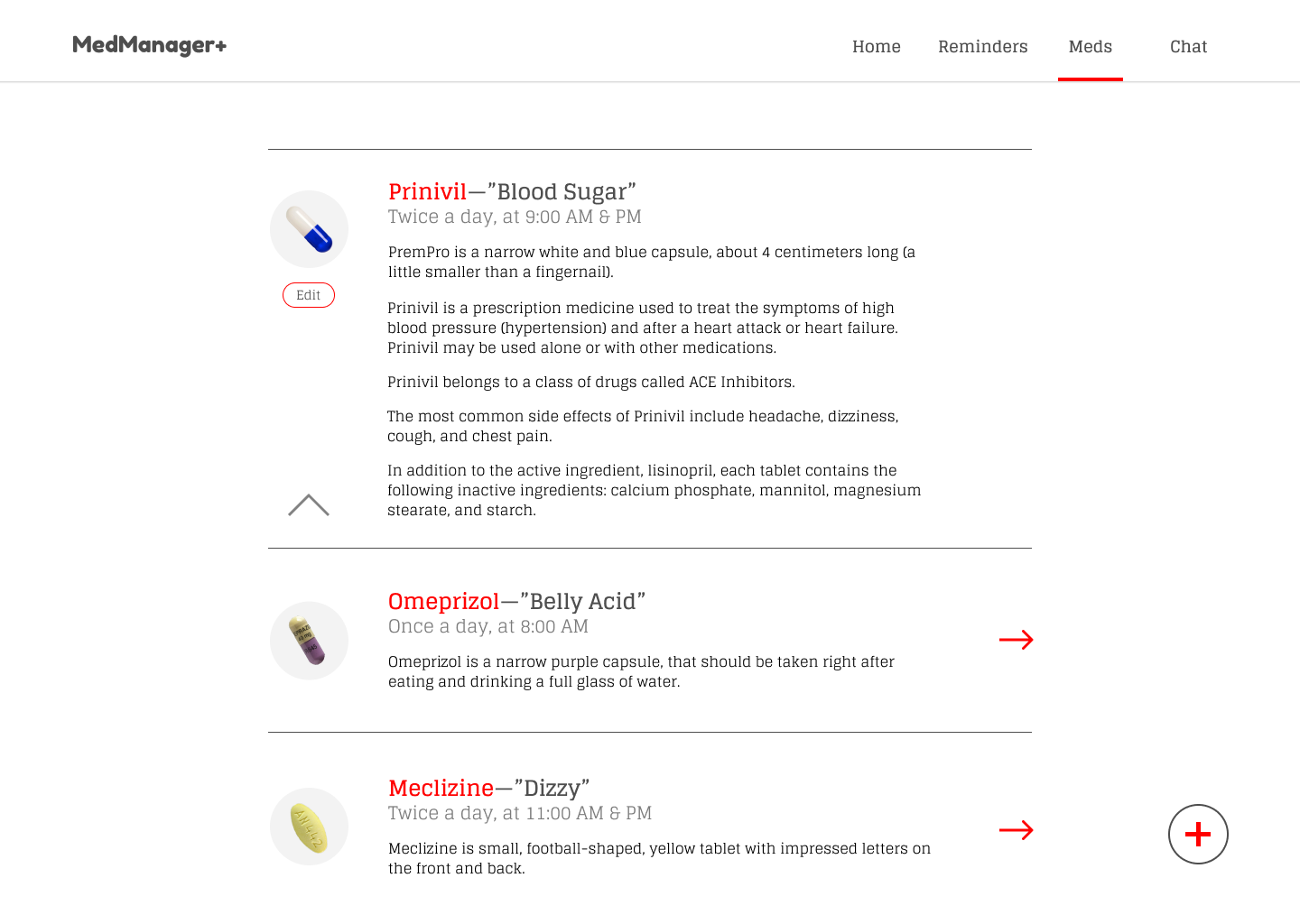
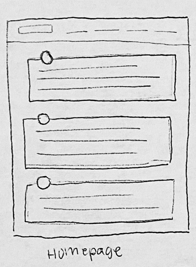
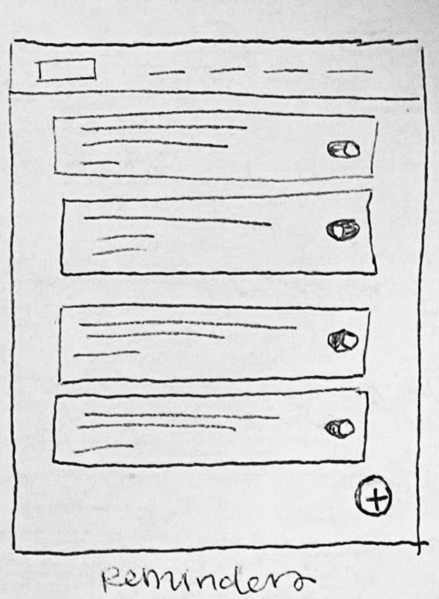
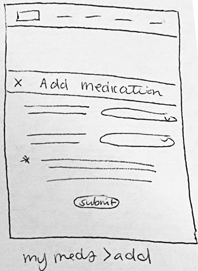
MedManager+
MedManager+ is a responsive web and mobile experience designed to help users organize and understand their medications with confidence. The tool brings clarity to a part of everyday life that often feel overwhelming, allowing users to track their prescriptions, understand each medication’s purpose, create nicknames for easier recognition, set reminders, and share information with their doctors. The goal is to simplify a complex part of daily life and create a sense of transparency, ease, and connection so users can manage their health with greater peace of mind.

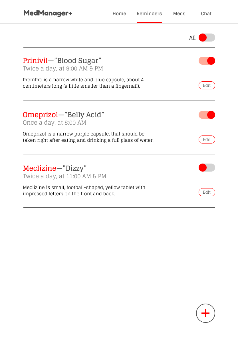
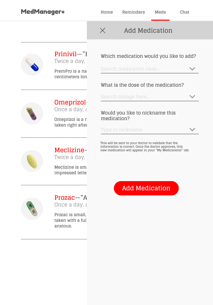
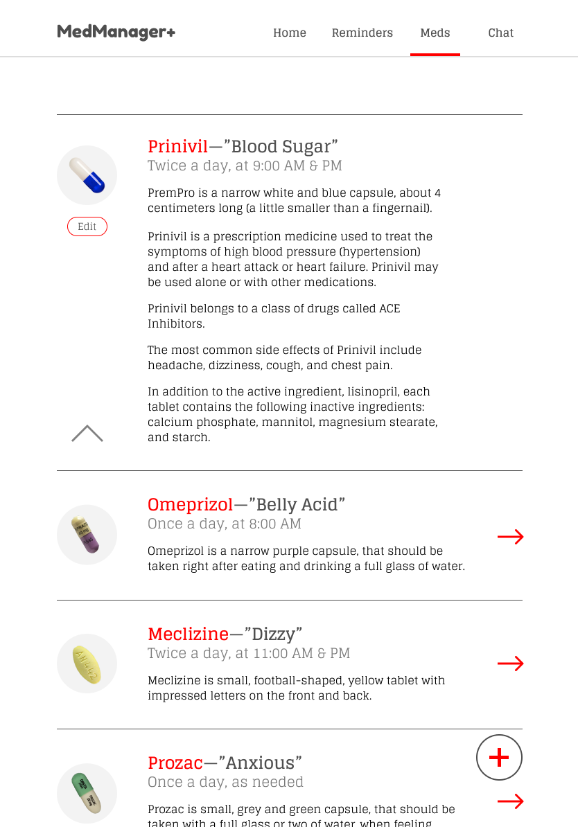
The visual system for MedManager+ uses a bold yet simple palette and a clean structural layout to promote ease of use. Every element is designed to help users feel informed, grounded, and confident in the actions they’re taking. By keeping the interface uncluttered and high‑contrast, the experience reduces confusion and brings clarity to a topic that can often feel overwhelming. The result is a design that feels structured, trustworthy, and supportive, empowering users to navigate their medications with greater understanding and ease.


Tablet wireframes

Desktop wireframes